Crochet Marketplace
This website project was developed as part of my UX/UI certification program, but inspired by a real client need. A local crocheter was looking to improve their customers’ digital experience, so I designed a solution focused on clear navigation, product discoverability, and trust-building elements. The goal was to create a site that felt personal and handmade, while still incorporating best practices in usability and mobile responsiveness.
This crochet store allows visitors to purchase items or place a custom order. The most common users are young people between 18-30 years old, students and young professionals.

The Problem
Currently there are no online stores in the region to purchase crochet accessories. When users search on social media for possible suppliers in the city, they need to wait up to 3 months depending on the waiting list

The Goal
Design an online store that offers to buy crochet items in stock for those occasions when the waiting time exceeds the requested delivery date and order customized items.
User research
Knowing the user
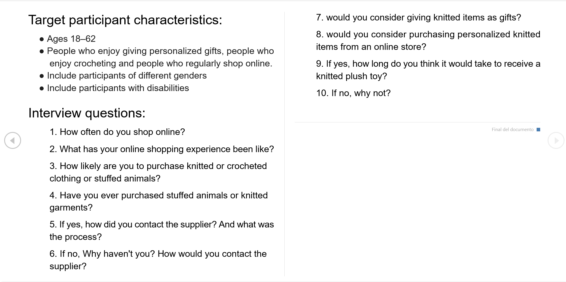
Since I had direct access to the business owner, I took the opportunity to ask about her clients’ feedback—specifically their frustrations, concerns, and overall experience with the current purchase process. To complement these insights, I also prepared a survey targeting potential new customers: individuals who hadn’t purchased crochet products before but enjoy giving personalized, handmade gifts. This helped me better understand their perceptions and hesitations around buying handcrafted items online.
Pain Points

Availability
There are no options to buy from an online store dedicated to selling crochet items in the region.

Misleading products
The internet options available for online shopping offer other products which makes it difficult to find what you are looking for.

Long waiting lists
Users get discouraged when they discover that their orders will not be ready in time and decide to buy something else.
Ideation
Problem statement:
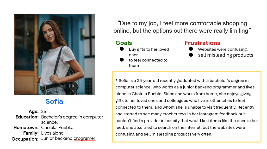
Using personas helped me to synthesize the insights gathered from the surveys into clear, relatable user profiles. They allowed me to identify common behaviors, and pain points.
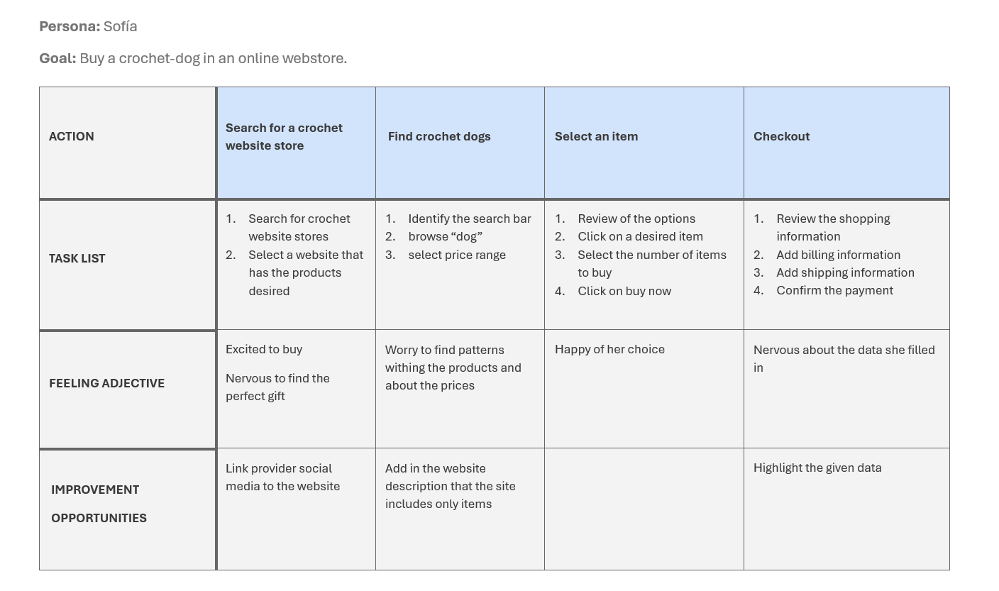
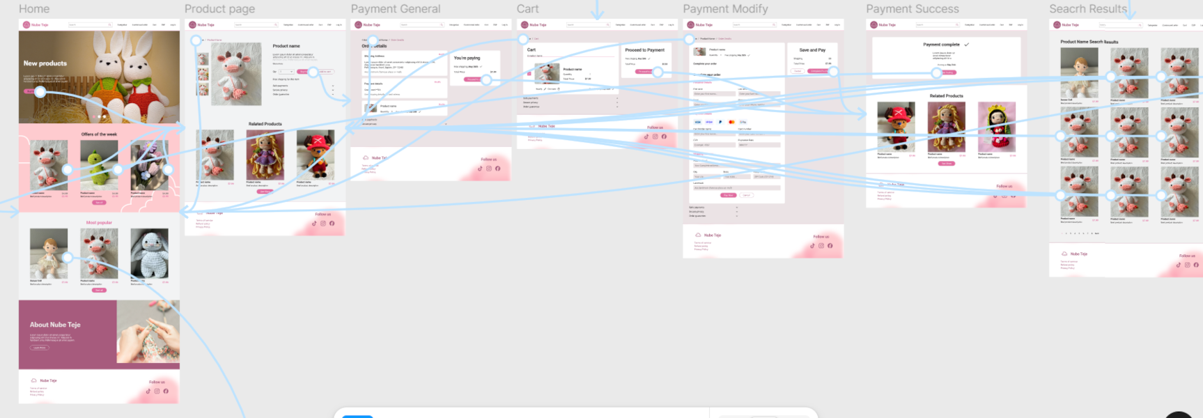
I used the journey map to get an idea of how many windows the website store would require as well as to identify opportunity areas
The Design
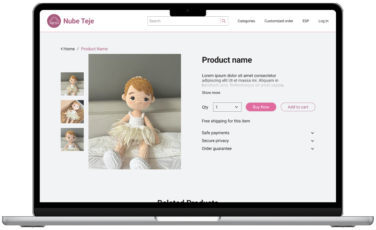
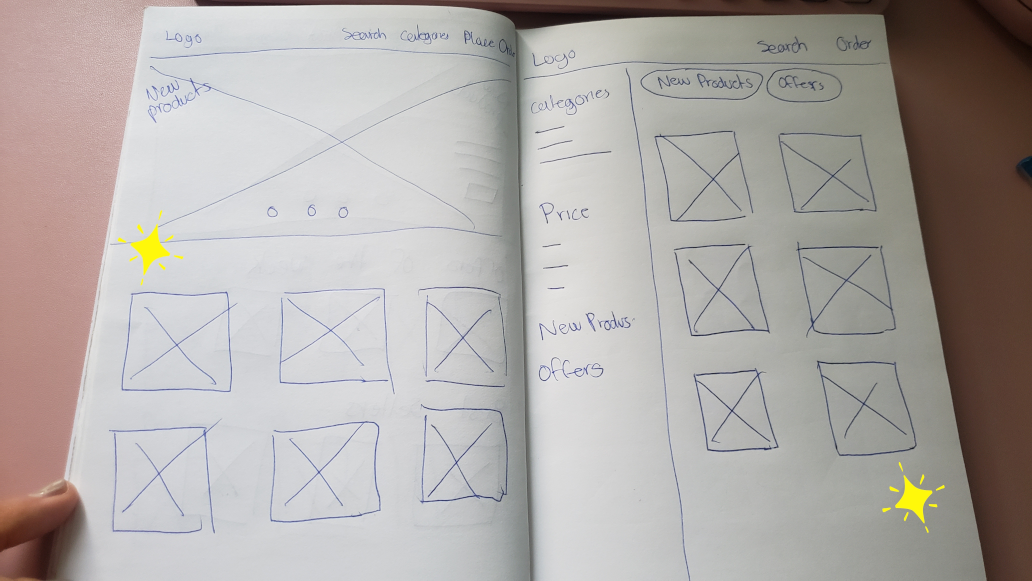
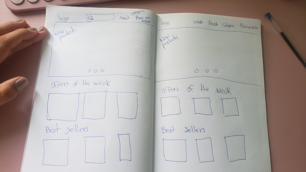
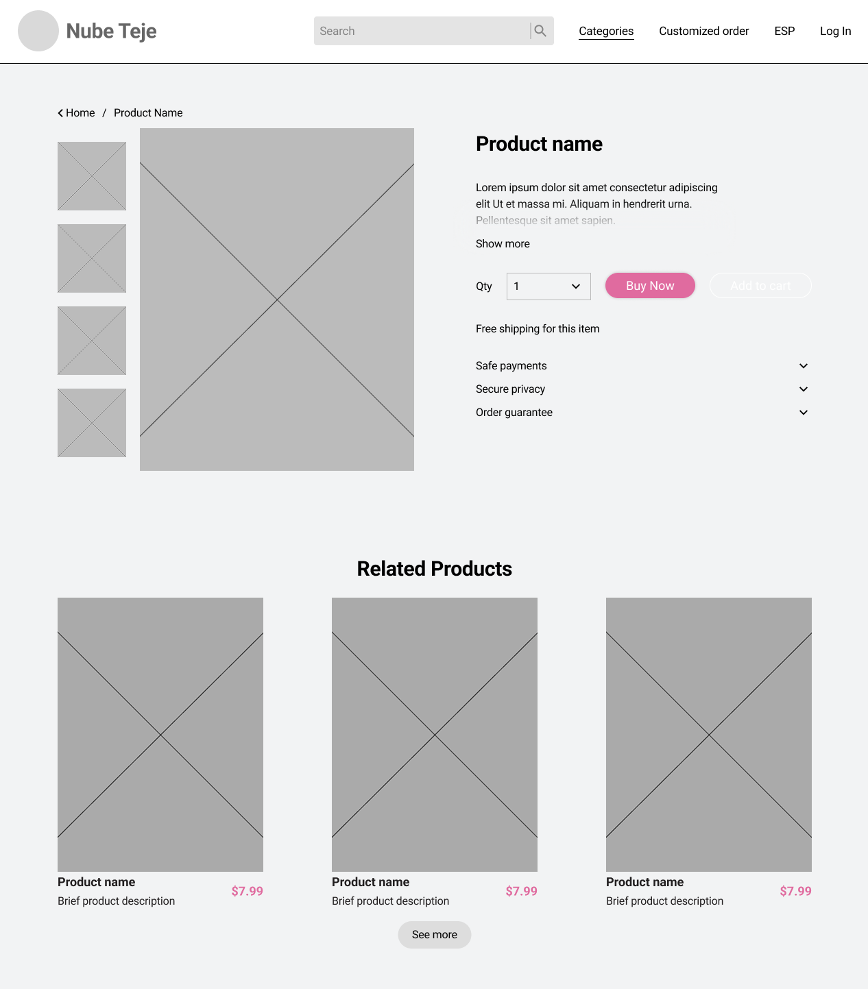
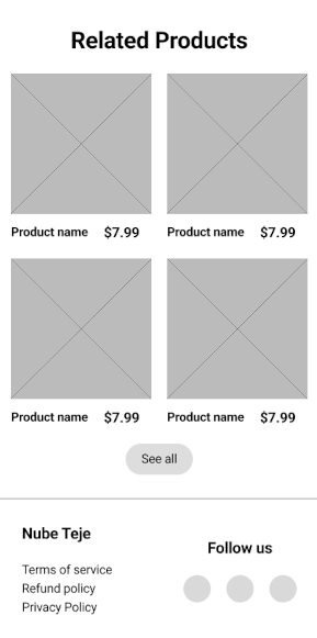
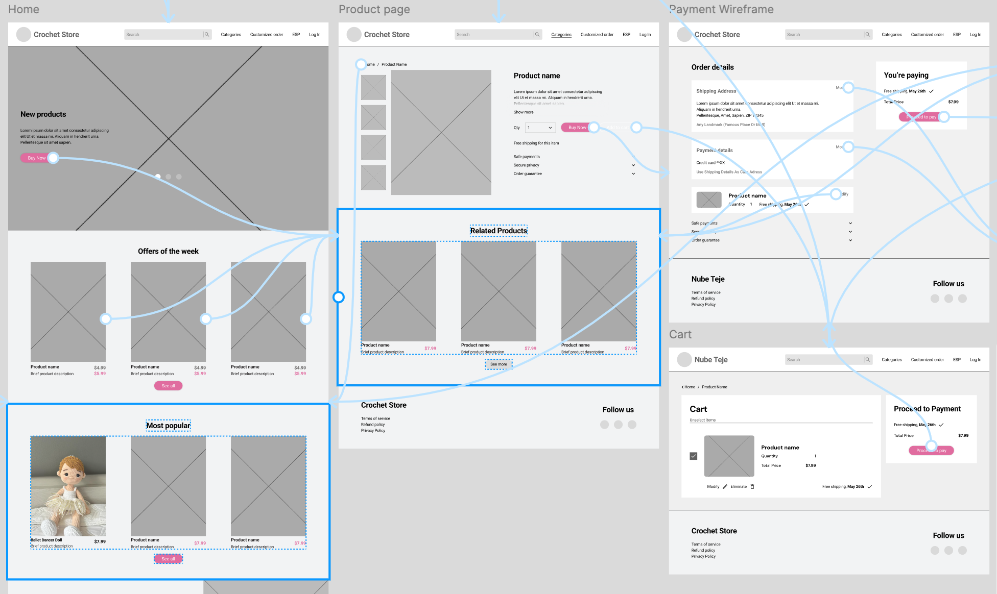
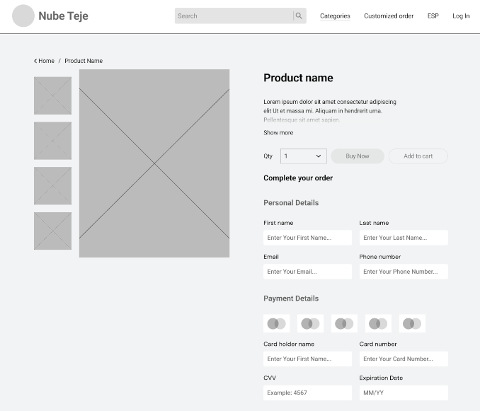
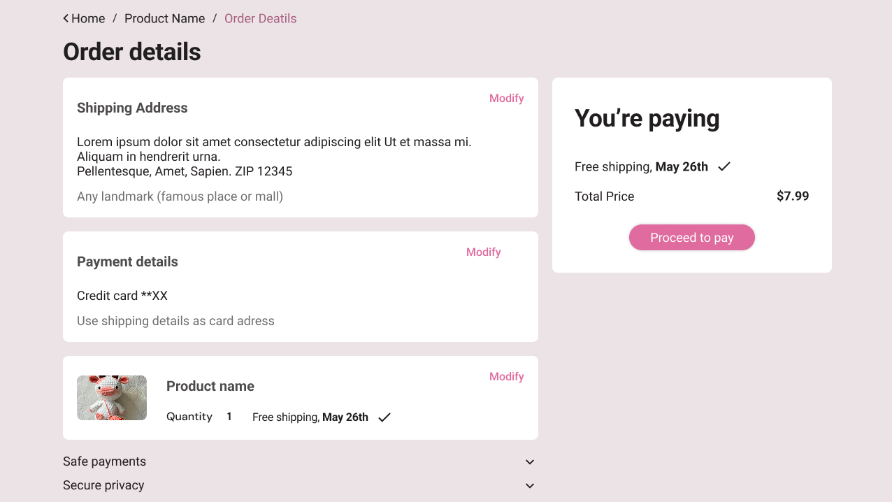
I began the design process by defining the key pages needed to meet user needs and ensuring the navigation felt intuitive—similar to the way users flow through a social media experience. To guide layout decisions, I sketched examples from popular online stores, analyzing which elements could best serve this type of small business and how they would adapt across different screen sizes. As I moved into wireframing, I chose to model the buying process closely after large e-commerce platforms to create familiarity, while keeping the rest of the site aligned with the brand’s handmade identity—a core value uncovered during user research. When preparing the low-fidelity prototype, I initially sent it as-is, but after receiving early feedback, I added a welcome screen to explain the testing process and clarify that blank sections would later be filled with images. Since the test was conducted in Mexico, the welcome screen was presented in Spanish, while the rest of the interface remained in English, to support both local context and global presentation.
Visit Low fi prototypeUsability Study Findings
After completing my low-fidelity prototype, I conducted an unmoderated online usability study with 12 participants from Puebla, Mexico, each session lasting between 10–15 minutes. The goal was to identify pain points in the user journey and test how intuitive the interface felt in a real-world context. Several key insights emerged:

Add Cart
Users found it frustrating to be redirected to a new page when clicking “Add to Cart,” as it disrupted their browsing flow.

Modify order
When editing their order details, some participants struggled to tap the correct option due to limited clickable space, especially on smaller screens.

Search bar
The search bar, while helpful, lacked a clear exit—users had trouble closing it after completing a search, which interrupted the experience.

Get the Cart
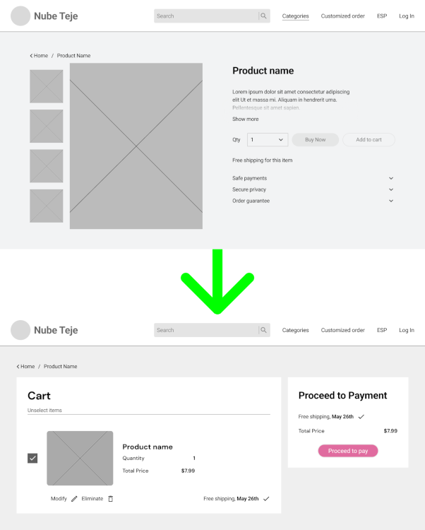
Users Couldn’t get to the cart page suing the navbar or by themselves, it was necessary to buy something
These findings gave me clear direction for the next iteration, focusing on streamlining navigation, improving touch target sizing, and making essential features more discoverable and self-evident.
Refining the design
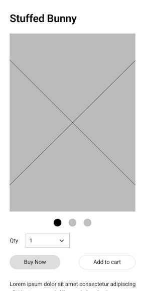
After receiving feedback the flow for the button “buy now” was changed. At first the flow allowed users to buy in the same window without redirectioning to other pages but since some user found it confusing, it was decided to redirect to another window, so it was clear they were actually buying.
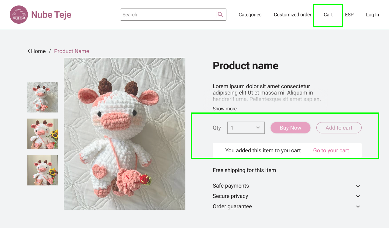
It was also necessary to modify the “add to cart Flow” instead of redirecting the user to the page, I decided to add an animation tha clarifies that the action was successfully done and if they wanted to see their cart, the option was right there but they could keep browsing. In addtion to this a link to the cart was added in the navbar.
Learnings
Although the website is not currently live due to budget constraints, this project was incredibly valuable from a learning perspective. It gave me the opportunity to sharpen my prototyping skills, uncover gaps in my initial design approach, and conduct a real usability study—something that significantly deepened my understanding of user behavior. I learned how to gather, interpret, and apply feedback to improve the experience, and saw firsthand how small adjustments can have a meaningful impact. Most importantly, the process reinforced the importance of design accessibility, such as using the right contrast between text and background colors, to ensure usability for all. This project not only strengthened my technical abilities but also boosted my confidence in making user-centered design decisions.
Visit HiFi prototype