Streamlining Gift Sharing in Pokémon GO
Pokémon Go is a mobile game released in 2016. Among its features is the ability to reach a high friendship level to earn experience points, rewards, Pokémon, and special features. Over time, this activity has become less popular among the game's users.
I created this prototype to propose a redesign of the gift-sending process in order to increase user satisfaction with this activity.

The Problem
It's becoming more and more common for players to stop opening and sending gifts

The Goal
Redesign the current workflow of this activity to make it more entertaining and easier for players.
User research
Empathizing with the user
To better understand the issue, I conducted online research on user opinions regarding sending gifts across three platforms: YouTube, X (Twitter), and Reddit.
On YouTube, we found few videos focused on unwrapping gifts, but the ones that exist mention how complicated and tedious it can be to unwrap gifts and offer tips for streamlining the process.
On Reddit and X, the results are similar: users highlight how boring and tiring it is to send gifts because you have to do it one by one and watch a long animation for each interaction, which increases the time it takes to send gifts to your entire friends list—a process that generally makes them feel more like it’s a chore than a fun activity.
Pain Points

Time
Opening/sending gifts one by one can take more than an hour a day.

Order
The friend filter is limited, making it difficult to interact with some friends.

Repetitive
Performing the same action more than 40 times a day to earn rewards makes it tedious.
Ideation
User Journey Map Sending & Opening gifts

Problem Statement
Carlos has been playing Pokémon GO since 2020. He enjoys completing all the game's missions but hates repetitive tasks.
Goals
Send multiple gifts in a single stepOpen multiple gifts in a single step
Opening gifts
Friends Menu
- Users opens the app on their phone.
- Wait for the home screen to load.
- Tap the avatar image to open the menu.
- Scrolls to the left to access their friends list.
Friends Selection
- Find the filter button and click it.
- Click the “Friends who sent gifts” option.
- Press and hold the card for the first friend that appears in the results.
- Keep selecting friends until they reach the limit on the number of gifts you can open.
- Press the “Open” button.
Opening Gifts
- They will be redirected to the gift-opening window.
- Click the “Save Gifts to Scrapbook” button.
- Click the “Open Gifts” button.
- Watch the gift-opening animation.
- A summary of everything they received will appear.
- Users will automatically return to the home window.
Sending gifts
Friends Menu
- Users opens the app on their phone.
- Wait for the home screen to load.
- Tap the avatar image to open the menu.
- Scrolls to the left to access their friends list.
Friends Selection
- Find the filter button and click it.
- Click the “Friends who sent gifts” option.
- Press and hold the card for the first friend that appears in the results.
- Keep selecting friends until they reach the limit on the number of gifts you can open.
- Press the “Open” button.
Friends Menu
- Users opens the app on their phone.
- Wait for the home screen to load.
- Tap the avatar image to open the menu.
- Scrolls to the left to access their friends list.
Opening Gifts
- They will be redirected to the gift-opening window.
- Click the “Save Gifts to Scrapbook” button.
- Click the “Open Gifts” button.
- Watch the gift-opening animation.
- A summary of everything they received will appear.
- Users will automatically return to the home window.
The Design
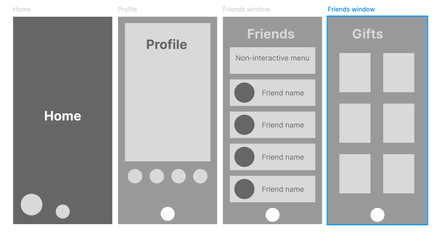
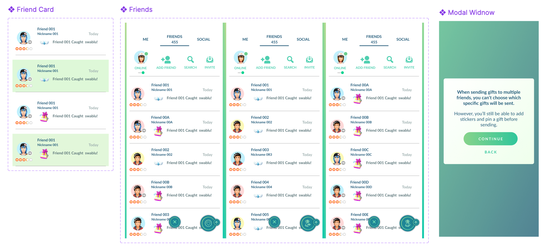
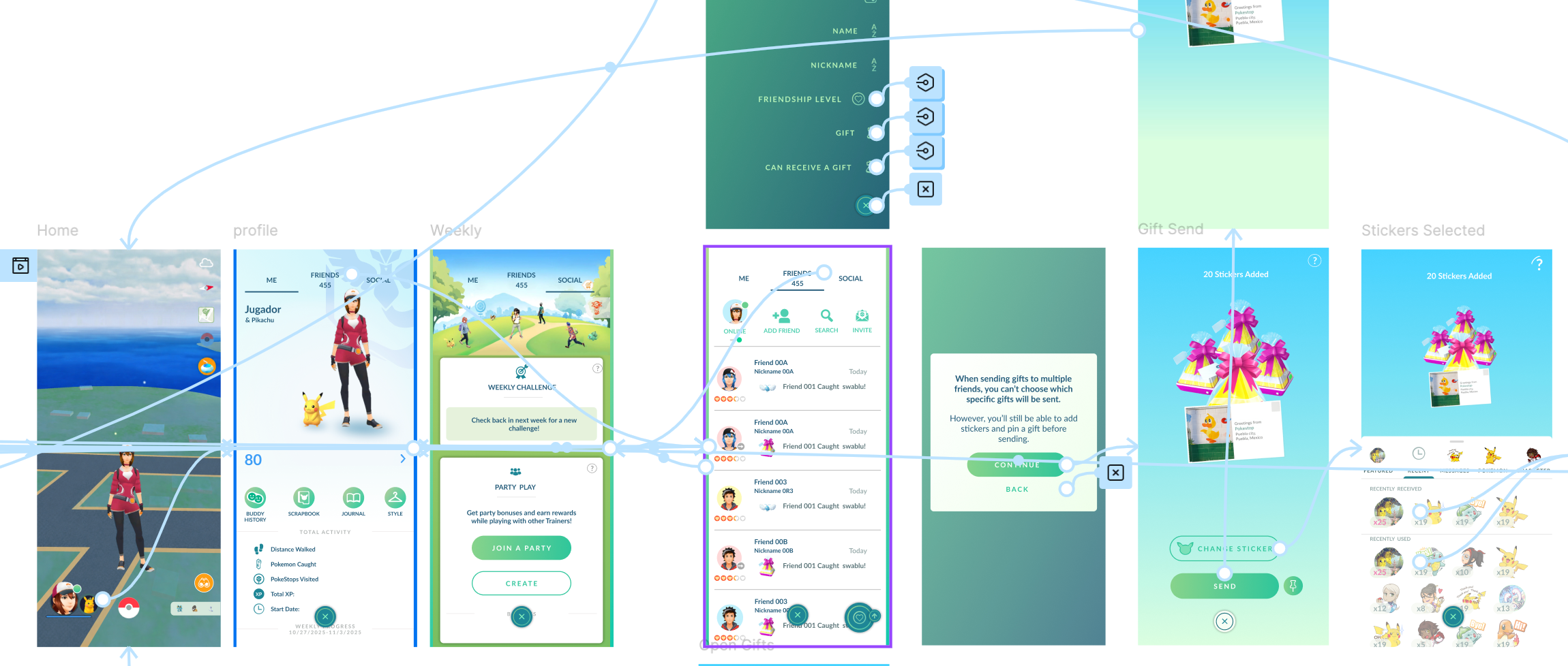
Before beginning the faithful recreation of the screens, I took the time to create a simple user flow based on the sketches I had already drawn, but without actually prototyping these wireframes. I used this part of the process solely to validate that each screen I had mapped out was ready to be faithfully recreated. As a result of this process, I discarded a gift selection screen because, upon reviewing the wireframe flow, I realized it wasn’t necessary.
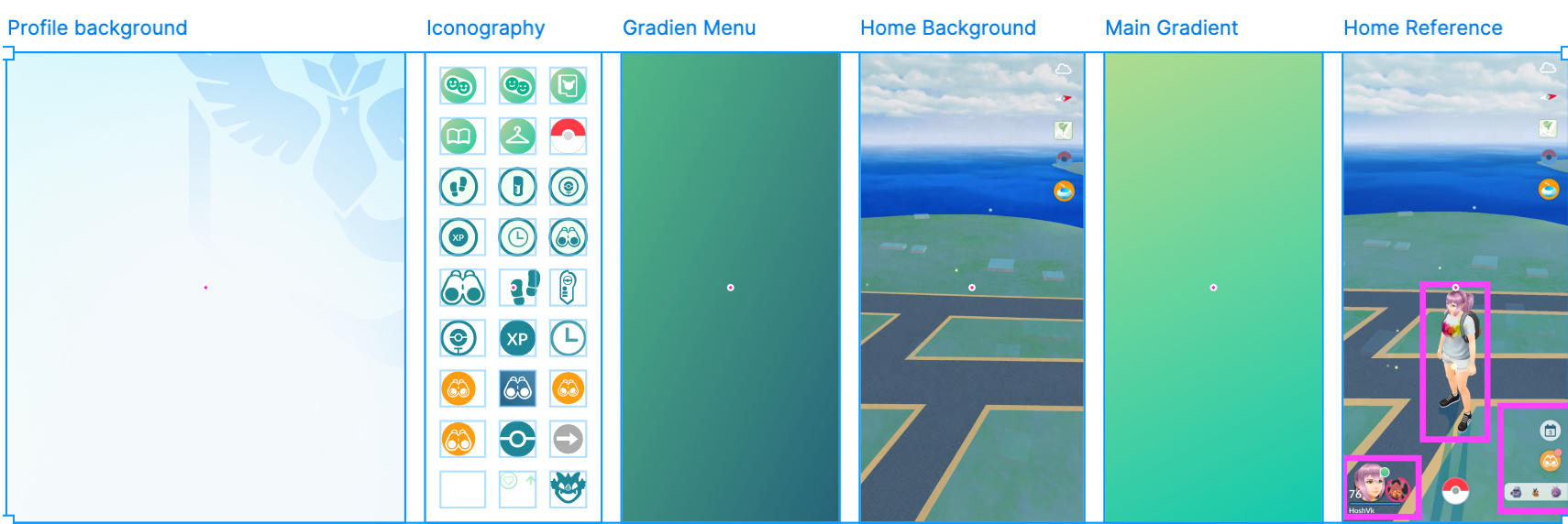
The next step was to search the Figma community and the internet for any free Pokémon GO libraries. Unfortunately, I didn’t find much, so I had to create a library from scratch for this project, as well as iconography and wallpapers using screenshots from the game, AI tools that helped me clean up elements within the images, and PNG-to-SVG converters to speed up the creation of icons.
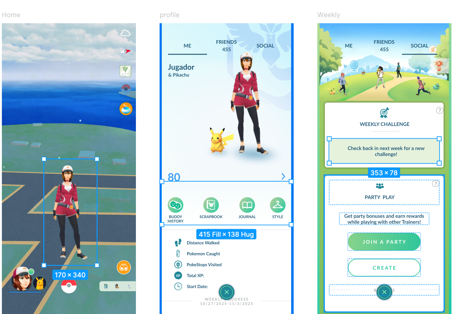
Once I finished reviewing the screens, I proceeded to recreate them as faithfully as possible to the Pokémon GO style. This involved reviewing how certain existing in-game dynamics looked to ensure they aligned with the proposed designs.
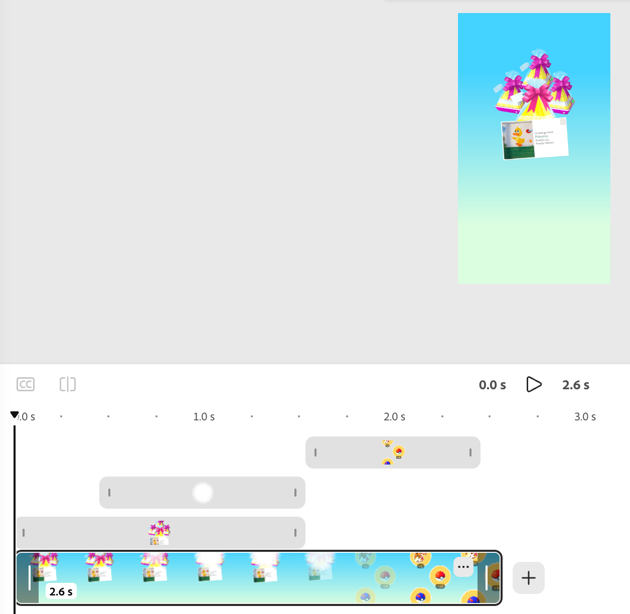
For the animations of sending and receiving gifts, I used Adobe Express and tried to make them as close as possible to the ones currently in the game.
Prototyping this design was one of the most challenging parts, as I had to use variables, nested components, and multiple actions triggered by a single action. Even so, the fidelity of this prototype isn’t very high due to Figma’s inherent limitations, which prevent it from detecting certain user interactions, such as “long press.”
For these reasons, I decided to conduct a moderate in-person usability test for this design.
Visit PrototypeUsability Study Findings
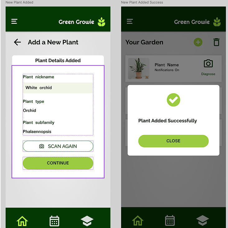
In order to identify pain points I conducted an unmoderated online usability study with 10 participants from Mexico, each session lasting between 10–15 minutes. Each participant received were asked to achieve two goals, one was to add a plant and the second to add a SOS schedule plan. The findings are listed below:

Buttons
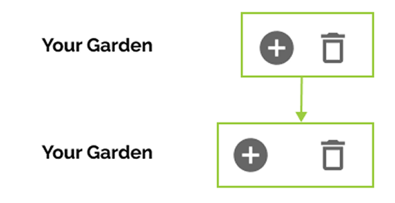
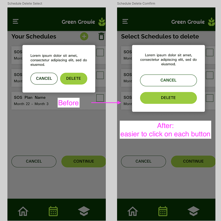
The buttons at the top of the add, were too close to each other making it difficult to click

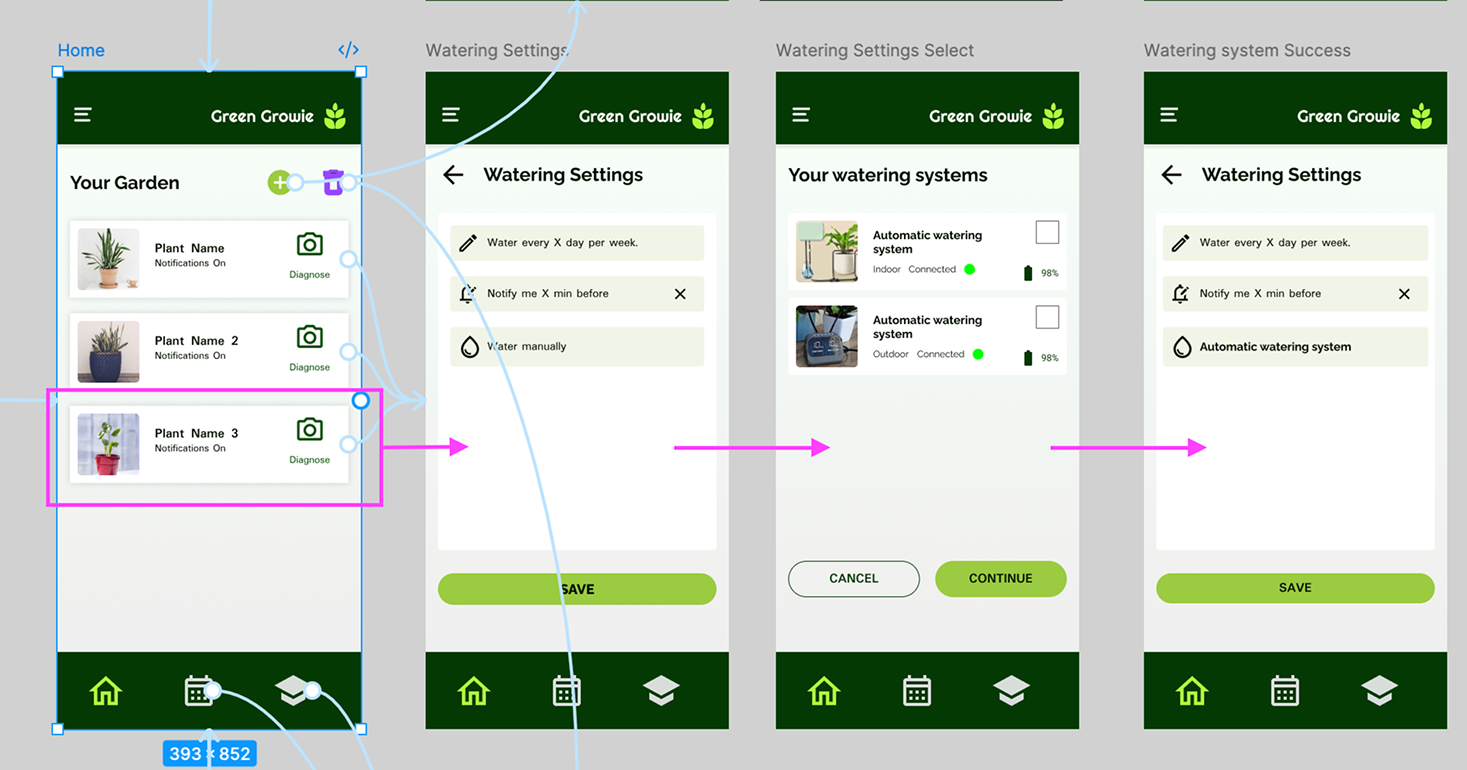
Watering system
Users found it confusing the option to configuring the watering options while adding the plant.

The flow
Many users expected to be able to add the plant with les steps as well as to configure notifications and watering in another process.

Plant settings
The first version of the prototype missed an plant setting window.
The Redesign
I Started by the easier part of the feedback but that was also imperative to modify in order to conduct the more studies, Adding more space between button and making the smaller and prototype the plant window setting.
The point 2 and 3 were closely attach to each other since it was a flow insight. To make the process simpler, a summary-modal window was added once the plant was successfully registrered.
This project was more challenging that I initially thought. Early in the project I realized that I felt a little bit insecure of how I would address the Architecture infrastructure since this was an app, Now I can say I feel more comfortable using a user flow for that. Another of my paint points was the lack of hover effect, which is one of my favorite design elements, but I think the use of icons compensated it.
I know this project is something that can be improve so I’m planing on coming back frequently to make some changes but as for today I feel very satisfied with my work.