Plant Care App
As part of my UX/UI certification, I designed a mobile app from scratch to strengthen my skills in app-specific user experience. Due to limitations in conducting real interviews, I simulated user research using AI-assisted responses to inform the design. This project allowed me to explore end-to-end design, from user flows to interactive prototyping, while practicing interface design for small screens.
The Green Growie is an app designed to help users to take care of their plants by tracking the watering and fertilize schedule.

The Problem
Available Plants care apps offered either replace human participation in gardening or a lack of technology integration, reducing their role to watering reminders.

The Goal
Design the Houseplant hero app to be able to adapt its support to the user lifestyle by allowing automate task in specific date or hours and by allowing users to connect and growth a community.
Plant Care App
Empathizing with the user
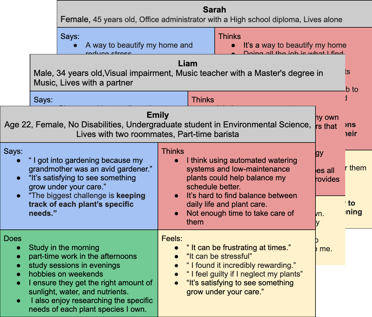
I planned user interviews—which, in this case, were simulated with AI—to practice identifying target users and their needs. I used empathy maps as a tool to better understand their emotions, behaviors, and pain points.Through this AI-driven scenario, I discovered that many users enjoy gardening as a way to unwind from demanding jobs. However, during high-stress periods or tight deadlines, they often neglect their plants and lose motivation to continue the hobby. While many gardening apps offer reminders for watering and feeding, few provide physical support, and those that connect to automated watering systems tend to fully take over the process, which removes the sense of hands-on care that users value.
Pain Points

Automation
The connection to watering systems gets enable once configure, user wants an assistance that helps them once a deadline is coming but back up afterwards.

Human connection
By using an app that offers AI assistance, users worry about losing interaction with their families and friends, since they use this activity as a way to bond.

Advice
Users enjoy experimenting and gardening by themselves, although, they preferred have proven techniques by other users at hand.
Ideation
Problem statement:
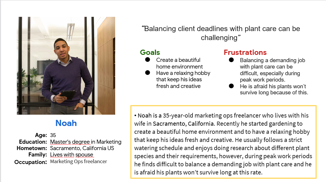
Noah is a marketing ops freelancer with peak work periods who needs to find a way to balance a demanding job with plant care because he wants to create a beautiful home environment and to have a relaxing hobby that keep his ideas fresh and creative.
I used Noah’s journey map to find possible areas of improvement that wasn’t on the product overview yet.
The Design
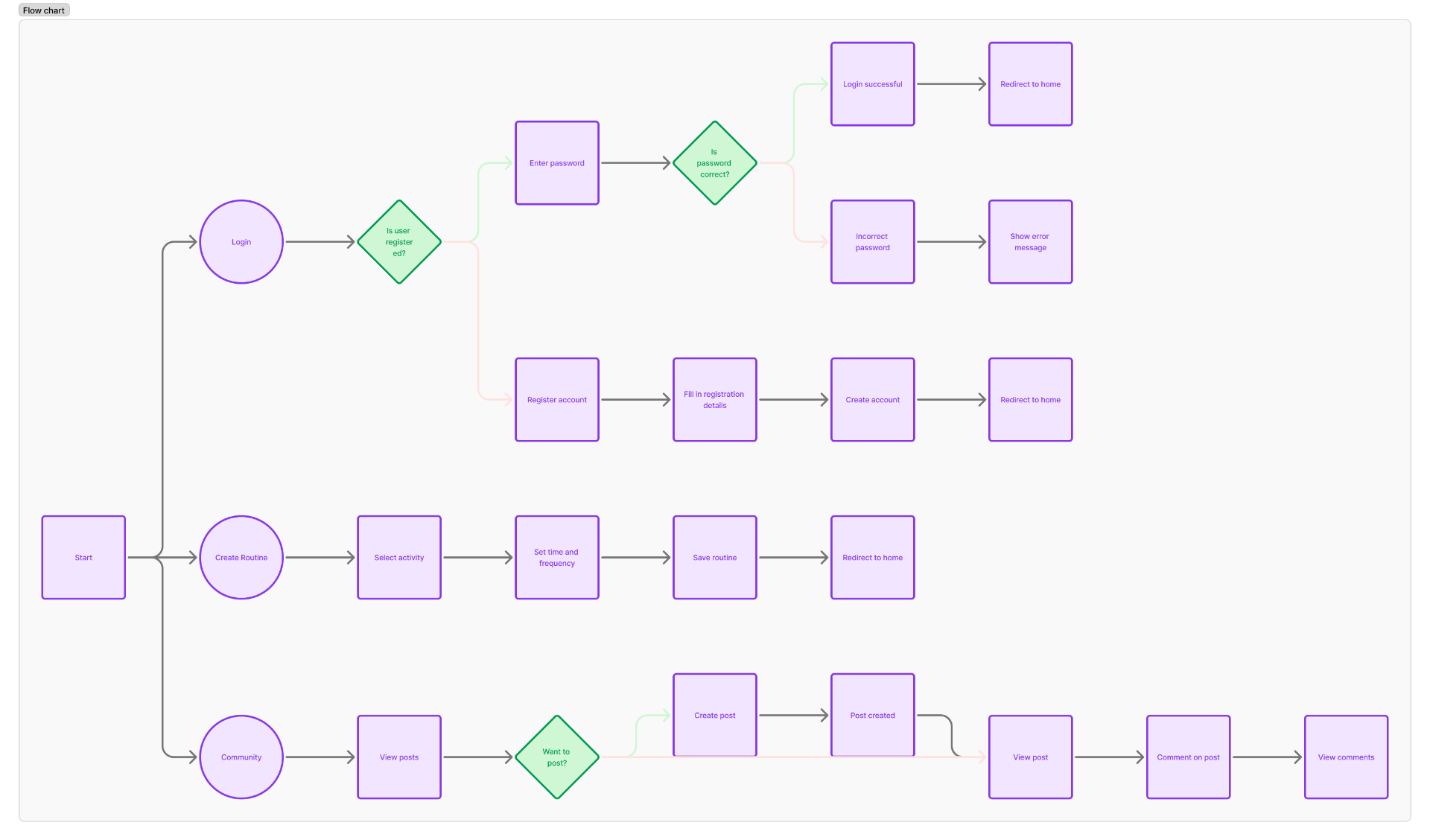
Using the empathy maps, I identified that the most frequently reported pain point was the need to schedule a custom watering plan for busy days. At the same time, I needed to consider common features from competitor apps and ensure that the community feature was accounted for. To organize all this, I created a user flow diagram in Figma, guided primarily by the user journey, which helped define the information architecture and allowed me to move forward with sketching
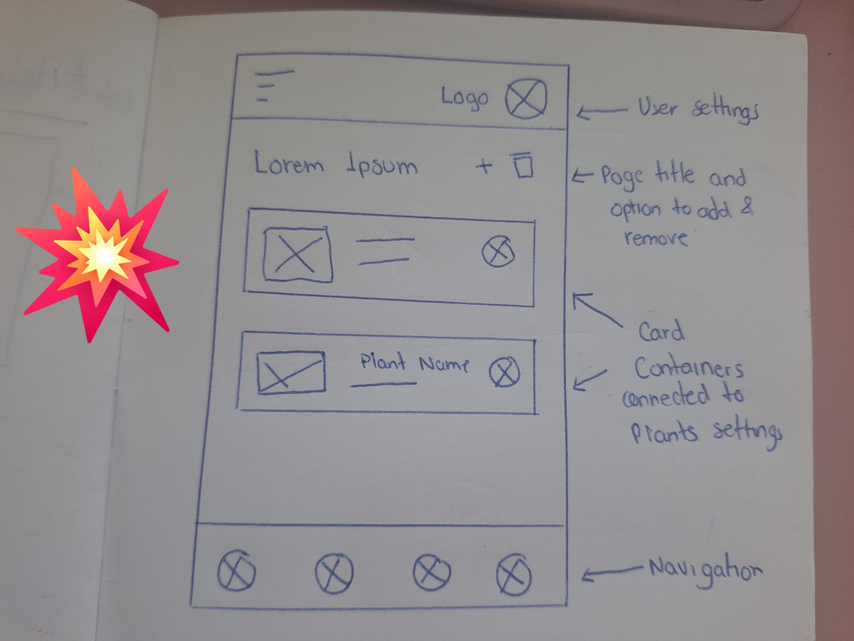
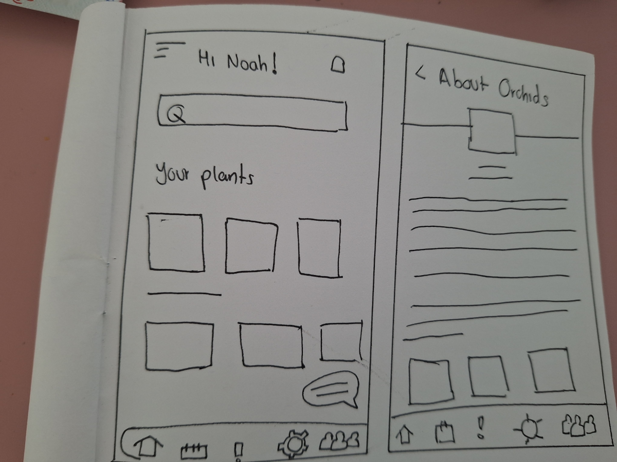
I began by sketching paper wireframes for each screen, placing extra emphasis on the start screen and how the SOS watering plan would be highlighted, as this feature directly addressed the user’s primary pain point. One of the key challenges was balancing quick-access options on this first screen without overwhelming the user.
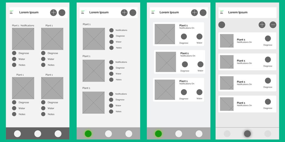
Once digitized, it became clear that the mobile format required a more streamlined approach—each card needed fewer options to maintain clarity and usability.
For the home screen, I decided to focus on displaying the user’s plants as clickable cards, leading to a detailed view with options such as “Water Now”, plant details, and personal notes.
Additional sections like the watering schedule planner and the knowledge hub were designed as separate modules to avoid clutter.
I used Figma for prototyping, as it's my go-to tool and allowed me to work efficiently. For this initial version, I focused on demonstrating the core scheduling feature, so the other sections were left out of the prototype to maintain clarity and focus.
Visit LoFi prototypeUsability Study Findings
In order to identify pain points I conducted an unmoderated online usability study with 10 participants from Mexico, each session lasting between 10–15 minutes. Each participant received were asked to achieve two goals, one was to add a plant and the second to add a SOS schedule plan. The findings are listed below:

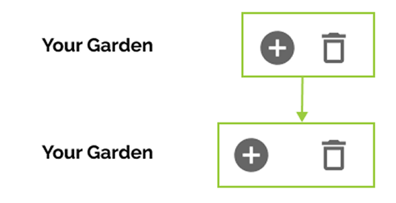
Buttons
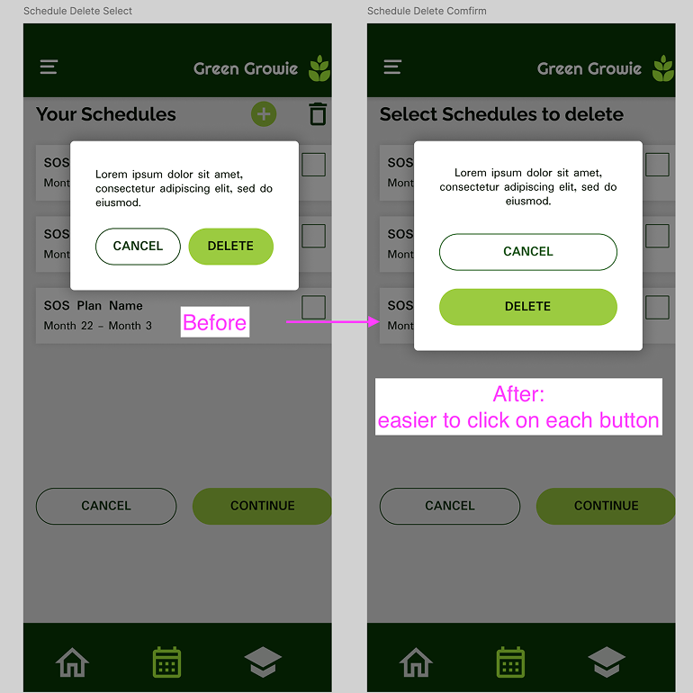
The buttons at the top of the add, were too close to each other making it difficult to click

Watering system
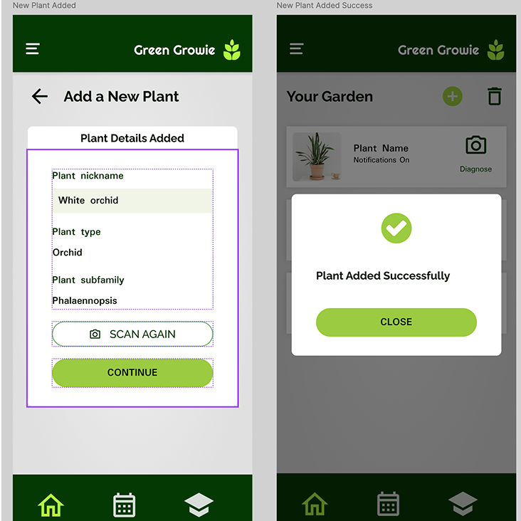
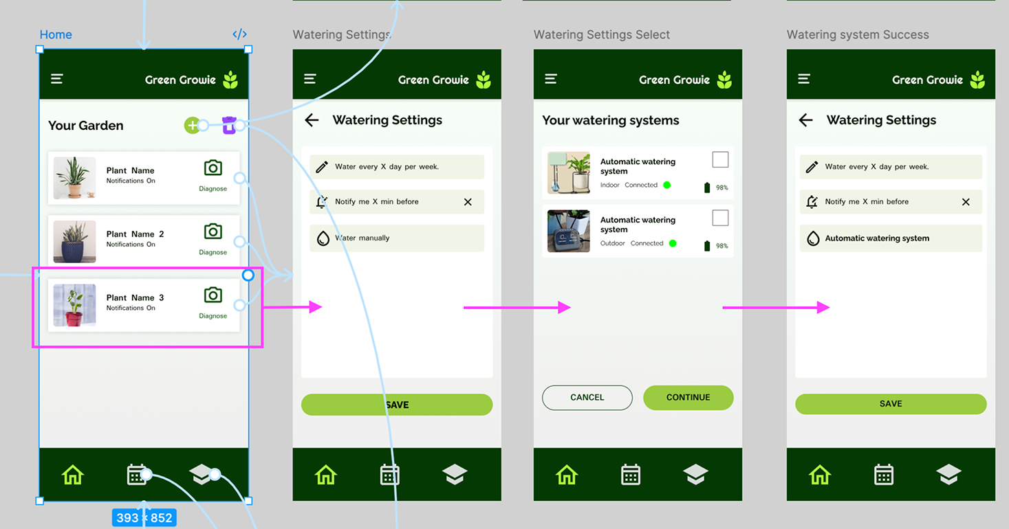
Users found it confusing the option to configuring the watering options while adding the plant.

The flow
Many users expected to be able to add the plant with les steps as well as to configure notifications and watering in another process.

Plant settings
The first version of the prototype missed an plant setting window.
The Design
I Started by the easier part of the feedback but that was also imperative to modify in order to conduct the more studies, Adding more space between button and making the smaller and prototype the plant window setting.
The point 2 and 3 were closely attach to each other since it was a flow insight. To make the process simpler, a summary-modal window was added once the plant was successfully registrered.
This project was more challenging that I initially thought. Early in the project I realized that I felt a little bit insecure of how I would address the Architecture infrastructure since this was an app, Now I can say I feel more comfortable using a user flow for that. Another of my paint points was the lack of hover effect, which is one of my favorite design elements, but I think the use of icons compensated it.
I know this project is something that can be improve so I’m planing on coming back frequently to make some changes but as for today I feel very satisfied with my work.